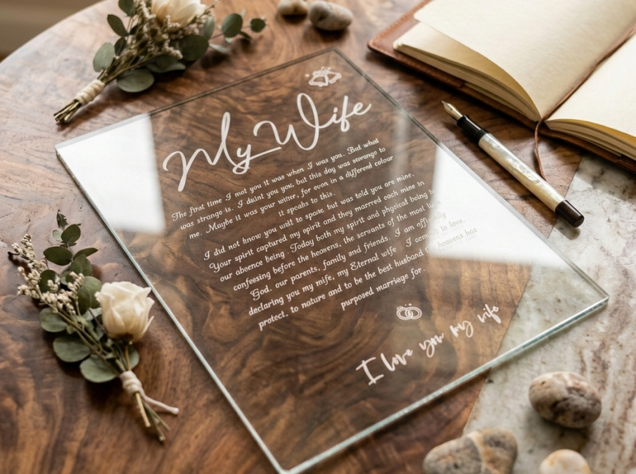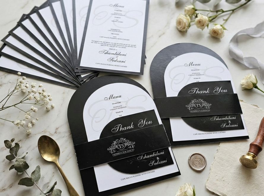
Guide every guest beautifully
Wedding signs and day-of stationery: a guest experience guide
Quick answer: A wedding sign works when guests see it at the moment they need to make a decision and can understand it in seconds. Plan signs around the guest journey—arrival, ceremony, transition, reception and table—then choose materials, sizes and wording for each location.
The best wedding signage is almost invisible.
Guests do not stop to admire how efficiently they found the ceremony, understood the programme or reached their table. They simply feel that the day is calm, considered and easy to follow. That feeling is the result of design doing a practical job.
The mistake is to start with a list of signs. Start with moments of uncertainty instead. Where could a guest turn the wrong way? What information will they need without asking a coordinator? Which words should be read from a distance, and which details will be held in the hand?
Map the day before you design the signs
Walk through the event as if you are a guest who has never seen the venue. Begin at the road entrance or parking area. Continue through the ceremony, drinks or photographs, reception, seating, meal and gift areas.
At each point ask three questions:
- What decision must the guest make here?
- What is the shortest clear instruction?
- How far away and in what light will it be read?
If there is no decision or useful information, a sign may be decorative rather than necessary. That is allowed—but it should be a conscious styling choice, not a substitute for wayfinding.
The essential wedding signs, by moment
Arrival: welcome and direction
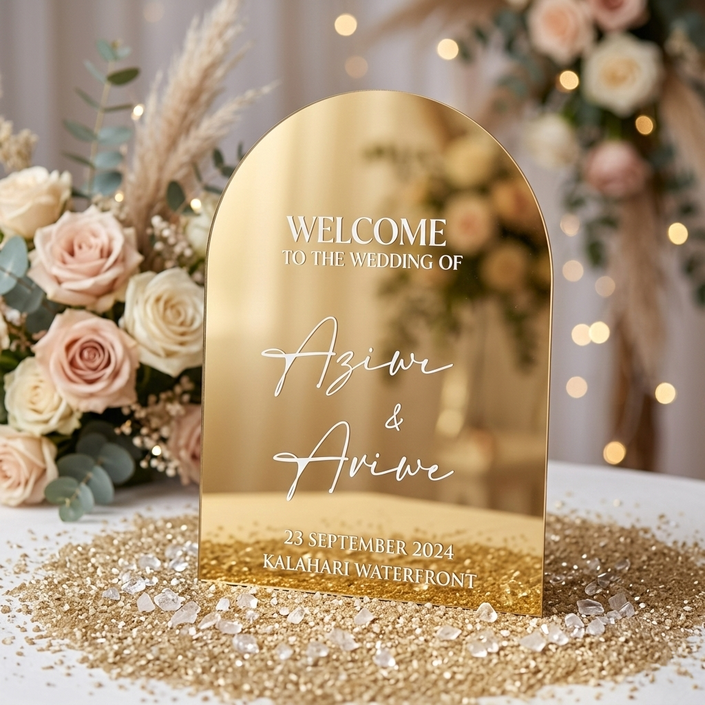
A welcome sign confirms the celebration and introduces the visual language of the day. It normally includes the couple’s names, wedding date and a simple greeting. Place it where guests naturally enter, not where it looks best in an empty room.
Directional signs matter when parking, ceremony and reception areas are not immediately obvious. Use familiar words, clear arrows and high contrast. One well-placed direction before a turn is more useful than a beautiful sign after it.
Acrylic
A polished material for statement entrances and keepsake pieces. Plan the stand, lighting, reflection and safe transport.
Correx
A lightweight, practical option for temporary directional or welcome signage, especially where easy placement matters.
Ceremony: programme and meaningful moments
A programme can introduce the order of service, participants, readings, songs and cultural or faith traditions. It is especially useful when guests may not be familiar with the ceremony. Keep it concise enough to follow while the event is happening.
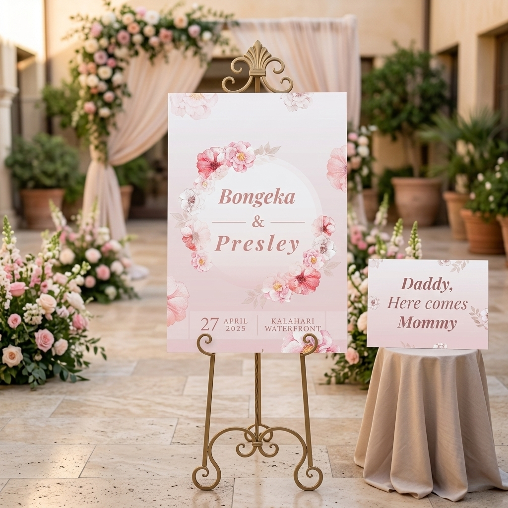
Reserved-seat signs, an unplugged-ceremony request or a remembrance note can be helpful where the instruction serves a clear purpose. A processional sign carried by a flower girl or boy is more expressive: it adds personality and creates a photographed moment.
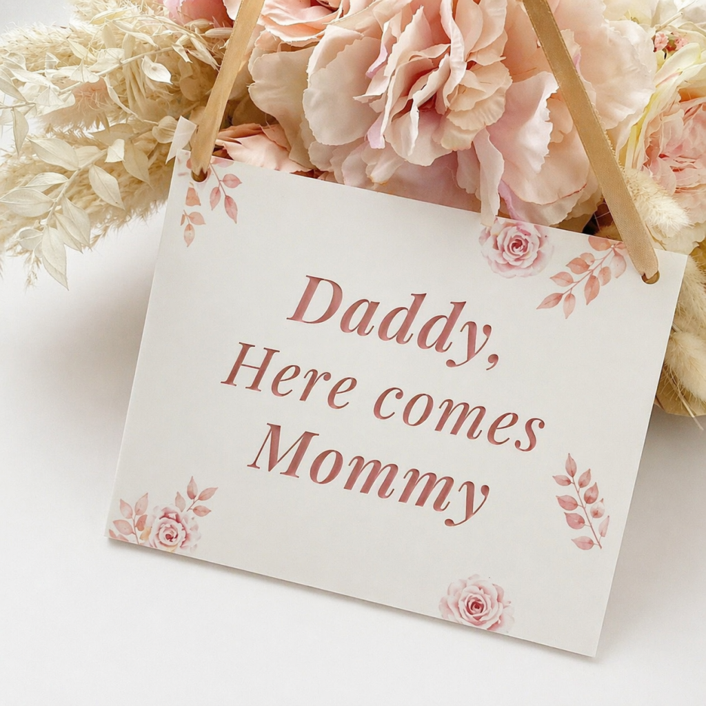
Transition: tell guests what happens next
The period between ceremony and reception often creates the most questions. A concise sign or programme note can direct guests to refreshments, photographs, transport or the reception area. If the timeline is flexible, communicate the next action rather than a precise promise.
Reception: seating and table information
A seating plan or escort-card display should be organised by the way guests will search. Alphabetical lists are usually faster for a large guest count; table-by-table lists let guests see the grouping. Whichever system you choose, keep names readable and leave enough physical space for corrections before production is approved.
Table numbers or names must be visible without blocking conversation. Place cards direct individual guests; menus explain the meal; small signs can label gifts, cards, favours or food stations. Each item should share the same design logic without becoming a miniature copy of the welcome sign.
How to choose the right size and material
Size is not a style choice alone. It is a reading-distance decision. A welcome message read from several metres needs fewer, larger words. A menu held in the hand can contain more detail. A seating plan needs enough space for every name at a readable size.
Before selecting a format, confirm:
- indoor or outdoor placement
- expected reading distance
- daylight, shade or evening lighting
- available stand, easel, wall or table surface
- wind, foot traffic and stability
- how the item will be transported and installed
- whether you want to keep or reuse it afterwards
Seven readability rules that protect the guest experience
- Say one main thing. Give each large sign a dominant message.
- Create contrast. Pale lettering on a reflective or busy background may disappear in real light.
- Use script selectively. Decorative type can carry names; practical instructions need fast-reading letterforms.
- Write for distance. Fewer words allow larger, clearer typography.
- Use consistent terms. Do not call the same space “reception”, “banquet hall” and “celebration area” on different pieces.
- Place information before the decision. Guests need the arrow before the turn.
- Test at full scale. A layout that looks clear on a laptop can be too small at the venue.
Using QR codes without creating frustration
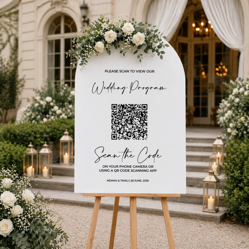
A QR code can link guests to a digital programme, schedule, map, photo upload or personal message. It should not be the only route to essential safety or venue information, and it must lead directly to the intended mobile page.
Before production:
- test the exact final code on more than one phone
- test it from the expected reading distance
- confirm the destination is mobile-friendly and public
- use a short written instruction such as “Scan to view the programme”
- check cellular or venue Wi-Fi conditions where it will stand
- keep a readable backup for essential information
Coordinate the suite without making everything identical
Coordination comes from repeated decisions: type families, spacing, colour relationships, shapes, icon style and material details. The welcome sign can be bold while a menu stays quiet. They should feel related, not copied.
Start with one anchor piece—often the invitation or welcome sign—then create rules for the rest. This makes later decisions faster and gives photographs of the day a coherent visual rhythm.
Your final venue walkthrough
Before approving quantities and placement, do one paper walkthrough with the venue plan. Mark every sign on a map and record who supplies the stand, who installs it and when it is removed. For personalised pieces, lock the source list and proof the final names against it.
Ask the venue or coordinator about restrictions on fixings, candles, outdoor supports and placement in walkways. A beautiful sign without a safe installation plan is unfinished work.
Frequently asked questions
Do we need both a welcome sign and directional signs?
Only if they solve different problems. The welcome sign confirms and sets the tone. Directional signs guide a turn or route. At a simple venue, one sign may be enough; at a spread-out property, several directions may be essential.
Can a QR code replace printed programmes?
It can reduce printed detail, but it changes how guests access the information. Consider phone use, signal, accessibility and the ceremony atmosphere. A short printed order with optional digital detail is often a useful combination.
When should day-of stationery be finalised?
Begin the design direction early, then confirm guest names, seating and menu information when those decisions are stable. Leave enough time for proof review and production; Uniplex will confirm timing against the final scope.
Can a welcome sign be kept after the wedding?
Yes, especially when the material and wording suit display afterwards. Decide this before design so the piece does not rely only on venue-specific instructions.
Design the calm your guests will feel
Guests should not have to work to understand your wedding. Put clear information where decisions happen, make it readable in the real environment and carry one considered visual language through the day. That is how signage becomes hospitality.
Planning references: sign types and guest-use cases cross-checked against The Knot’s wedding sign guide and wedding décor checklist. Adapt the plan to your venue, guest needs and confirmed production schedule.