The Uniplex Guide · Branding & Business
Brand Consistency Checklist: Keep Your Print, Clothing and Gifts Looking Like One Business
Quick answer: Keep business branding consistent with one approved set of logo files, clear colour references, a short style guide and a record of each finished product’s specification. Review the actual materials and keep one person responsible for final approval.
Customers should be able to connect the card in their hand, the shirt your team wears and the sign at your event. If each looks unrelated, you make recognition harder than it needs to be.
This brand consistency checklist helps growing businesses control the small changes that accumulate over time: stretched logos, outdated details, improvised colours and suppliers working from different versions of the same file.
Audit what customers can see today
Lay out your current business cards, flyers, clothing, gifts, displays and packaging. Add screenshots of your website and social profiles. Compare them as a customer would, without explaining away the differences.
Ask whether the business name, logo, contact details and message agree. Note which differences are deliberate adaptations and which are accidental. A simplified logo for a small garment area can be sensible; an old phone number is not a style choice.
Include both printed materials and online pages in the same brand check. Turn the differences you find into a short correction list, starting with inaccurate information and the items customers see most.
Build a brand folder someone else can understand
The folder should let a new colleague or supplier identify the correct files without guessing. Keep working concepts separate from approved assets, and remove superseded versions from the folder used for production.
- Logo masters: approved vector files and useful variants for light and dark backgrounds.
- Colour references: digital values and agreed print references, clearly labelled.
- Typography: approved typefaces, hierarchy and any licence requirements.
- Core wording: business name, main message and verified contact details.
- Templates: common layouts and product-specific guides.
- Approval records: dated final proofs and relevant finished samples.
Document the basic rules for your logo, typography and colours in one place. Your business can begin with a concise working document; it does not need a large manual to make the basics clear.
Expect materials to behave differently
Paper, fabric, ceramic and display materials do not reproduce colour in the same way. A screen preview also changes with the device and viewing conditions. Consistency means agreeing a coherent result across these contexts, not assuming one digital value guarantees a physical match everywhere.
Tell the supplier which colour is especially important, provide the best available reference and discuss the appropriate proof. Keep approved physical examples where practical, with the product and process identified. An unidentified old sample creates another guessing game.
Match the design to the available space
A detailed logo may work on a banner and become unreadable on a small item. Prepare approved simplified variants when necessary. Keep proportions, clear space and the relationship between elements deliberate. Avoid asking each supplier to invent its own reduction.
Record the product specification, not just the artwork
| Product type | Details to preserve for the next order |
|---|---|
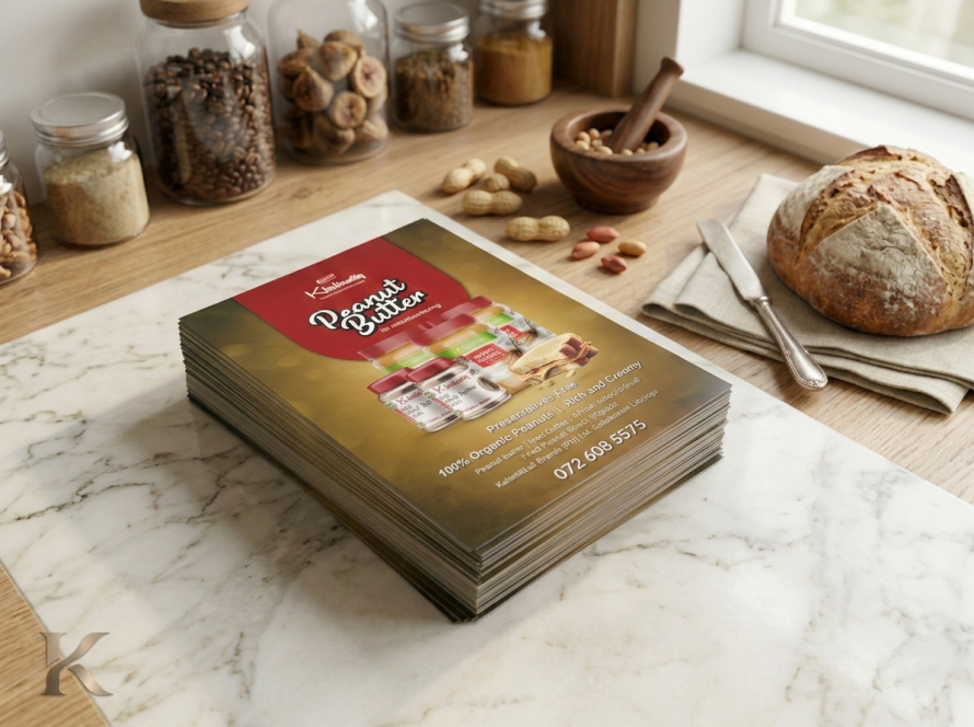
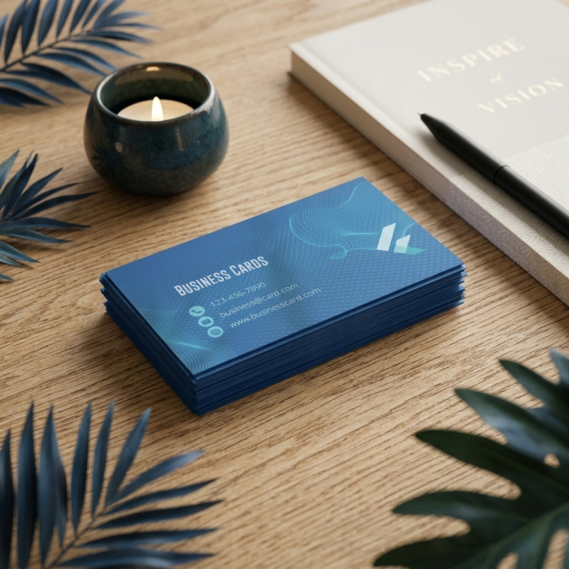
| Business cards and flyers | Dimensions, sides, stock, finish and approved file |
| Staff clothing | Product code, colour, sizes, method, logo position and dimensions |
| Drinkware and gifts | Exact item, branding area, method and personalisation list |
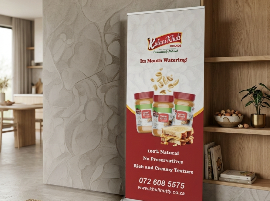
| Displays | Hardware, graphic dimensions, material and template |
| Calendars | Format, year, checked dates, layout and contact details |
The same PDF on a different paper or garment is not necessarily the same finished product. Recording the specification makes a repeat quote more accurate and helps you spot proposed substitutions.

Create one approval route
Nominate the person who checks the final proof. Other colleagues can give feedback, but consolidate it into a single change list. Identify the file version being approved and keep that approval beside the order record.
Before approving, check brand presentation and practical information separately. First review logo, colours, type and layout. Then check spelling, numbers, product details and links. Separating those passes makes it less likely that an attractive design hides an incorrect contact detail.
Plan a sensible rollout
If you are correcting a brand, do not replace everything at once without considering its purpose. Prioritise inaccurate information, the most visible items and products already due for reordering. Keep a clear changeover date so new orders use the approved identity.
For a phased refresh, you could start with Business Cards, bring the Pull up Banner into the same visual system, and then update Personalised Mugs or Wall Calendars. Choose the sequence around your actual customer contact points.
A business has new contact details and an upcoming event. It updates the cards and event display first, then refreshes staff clothing when replacements are due. The same approved logo and colour references are used throughout, so the transition is planned rather than improvised.
What to ask your branding partner
Ask how they store approved specifications, how they identify artwork versions and how they handle changed product availability. Request confirmation before a substitution affects colour, fit or finish. Keep your own records so the identity remains manageable even if a staff member changes.
For a fuller supplier checklist, read how to choose a branding partner. For file preparation, use the print-ready artwork checklist.
Brand consistency questions answered
Must everything look identical?
No. A flyer, mug and shirt serve different purposes. They should share an identifiable visual system while adapting to their size, material and use.
Do we need to redesign our logo?
Not necessarily. The problem may be inconsistent application, missing master files or outdated details. Audit those issues before commissioning a complete redesign.
Can a supplier guarantee the exact same colour on every material?
Ask what is achievable for the specific processes and how it will be approved. An unqualified promise across unrelated materials is not a substitute for agreed references and samples.
What should we send with a reorder?
The earlier order reference, approved artwork, full specification and any changed quantity or sizes. Confirm current availability and pricing before production.